Portugal Continental / EN
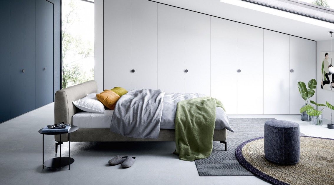
Bedroom
February 20, 2020
10 ways to use color in your bedroom

Not every room has to be decorated in black and white, right? Get to know the 10 most inspiring ways to use colors in the double room.
Forget the white walls, the wooden floor, and the matching furniture. If you're a fan of colors and uncommon decorations, this article is for you. So take your chances in decorating your double room and choose one of the 10 ways to use colors that we have prepared for you.
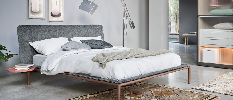
1. Sober and elegant
For those who don't want to risk too much in the color palette, it's best to start "slow". Choose dark colors to decorate your double bedroom and start with the wall against which the bed is.
The blue and grey tones are the best for this type of decoration and can perfectly be combined with the bedding. You don't need to paint all the walls, so you can even keep the white color on the rest.
2. Neutral
With neutral tones, there's no way you can mistake the decoration of your double room. But don't take this suggestion as "I'll only use the color white in the whole room" because that's not what we're talking about in this case.
You don't need to take the white off the walls, but you can bet on the beige and light brown tones on the bedding and pillows, for example. The same goes for elements like carpets, furniture, and even curtains. Decorative pieces in golden tones are also welcome.
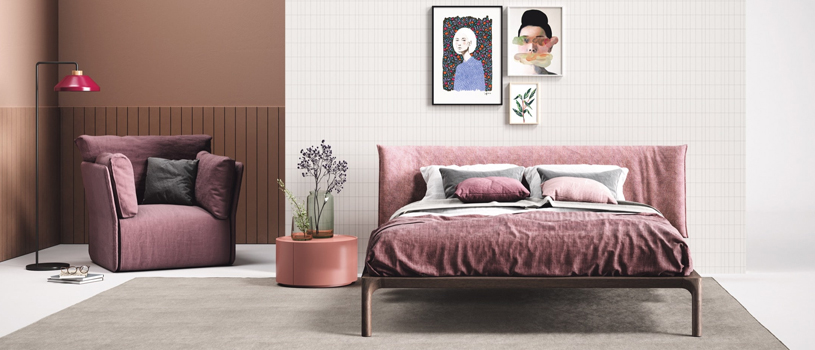
3. Tone on tone
One of the 10 ways to use colors in the double room without compromising the decoration is to go for a tone on tone. This means that you can (and should) use the same color, with different intensities, in the decoration of the double room.
Whether you choose pink, navy blue or even yellow, the important thing is that you distinguish well the "strength" of each chosen tone. By doing so, the walls can take on a stronger color than the head of the bed and the respective decorative objects (such as bed sheets, carpets, and pillows).
4. Wallpaper
Take a chance on the existing patterns and enjoy their potential when you decorate the double room. Use squared wallpaper, for example, and combine it with walls, cushions and bed sheets in plain patterns. Youll certainly love it!
5. Depth
Did you know that the way we use color can create a feeling of depth, simulating that space is larger than it is? You now know that on a white wall you can apply a contrasting color and thus create the desired feeling of depth.
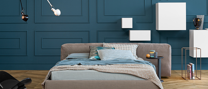
6. The dominant color
You don't need to use complementary colors, patterns or different textures to achieve the perfect decoration of your room; on the contrary, you can opt for a single shade and assume it in all the elements of the space.
Appeal to your good taste and choose the color you most identify with. You can use ground colors, blue or other darker/lighter shades and apply them to walls, carpets, decorative objects, and even furniture.
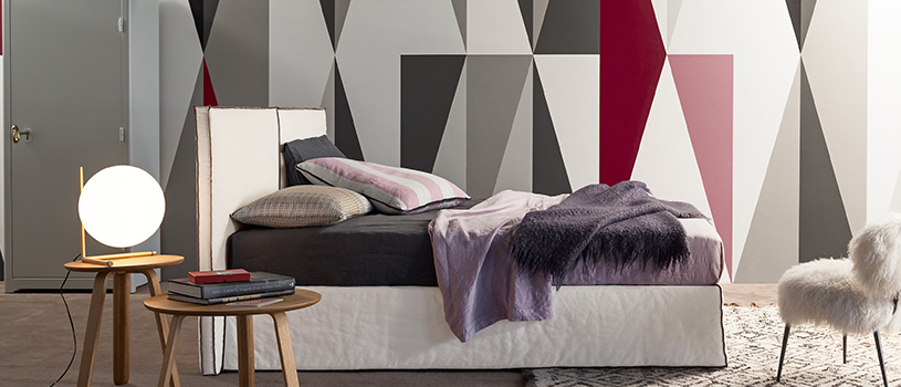
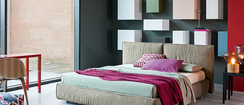
7. Geometric
Within the geometric logic, there are many decorative possibilities that you can apply to your double room. On a flat wall, you can include elements such as shelves to hold books, plants or paintings. The same applies to bed linen, which can be smooth and hold geometric fabric cushions.
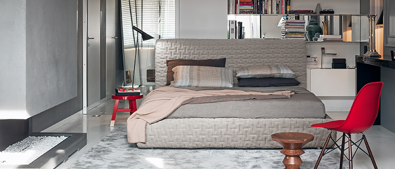
8. Velvet
Another way to use colors in the double room is to bet on velvet, which recalls to the luxury of any space. One of the elements that most benefit from this type of material is undoubtedly the head of the bed, which can be entirely covered by it.
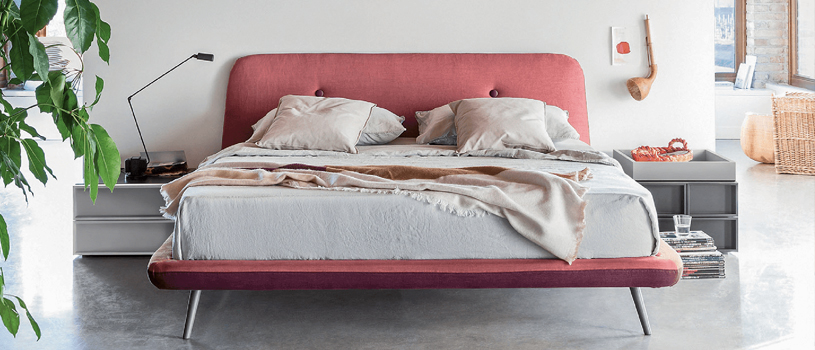
9. Yellow and gold
Using yellow and gold in decorative elements, and even in bedding, gives a lot of personality to the double roomwhich, by the way, is different from any other room it may have been in.
These shades also have another advantage: being able to be complemented with other shades, such as blue, white, and brown. The combination is unique and brings a unique atmosphere to the room.
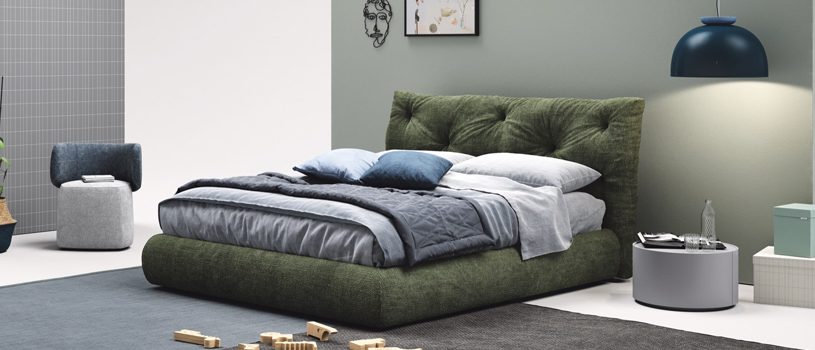
10. The green and the blue
Don't be alarmed, because we're not talking about the most vibrant shades of these colors. But if you think about it, nothing matches better than dark green and dark blue.
This is, in fact, one of the best ways to use colors in the double room, also because it allows you to include other contrasting colors, which makes all the difference in the decorationas it happens with orange and pink, for example.